Logo and website design journey: Angel Dog Care
“I can’t recommend Team Locals more highly! 10/10 for service, advice for all new media links & web design. Super for starting your business or existing, if you need the step up! They have guided me through my new business venture and website. I’m 100% happy with the service & ongoing support that they have provided. — Pippa”
When the lovely Pippa from her newly-founded business Angel Dog Care came to us back in June, we were determined to give her the best possible logo and website for her business.
Pippa recently launched Angel Dog Care, a professional dog walking service. Based in Portsmouth, Pippa offers the care and love of an experienced owner with many services. She needed a website which could communicate all of this, as well as a place to showcase her previous work with animals.
We met Pippa to discuss ideas, and gave her a few of our own, as she was pretty open to anything at that stage, mentioning that she would possibly like to incorporate a paw print and angelic elements. And off we went designing!
First Stage of Design
We started with a simple paw print and an angel halo, plus a dog bone and silhouettes of a dog. We wanted to keep the typeface simple and readable, but did mix in some script-style fonts to experiment.
Second Stage
Pippa gave us some brilliant feedback, picking out logos that she liked more that others, and offering suggestions on how to tweak them.
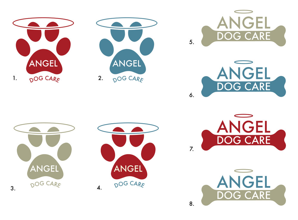
We revisited these concepts, adding colour to the ones Pippa preferred, and made a few more designs which looked great in colour.
Third Stage
We had an in-depth discussion with the client about why we liked each of the logos created at this stage of the project, whittling it down to a couple of concepts and finalising the colour scheme.
Final Logo
Once we’d decided on the final logo, we went back to it and tweaked it slightly, warping the angel halo and making sure everything was aligned and tidy.
Pippa couldn't have been more happy with it, and we couldn't wait to get started on the company's website.
Website Design for Angel Dog Care
Now we had a solid colour scheme and logo, we could get started on building a clear and professional website for Pippa's dog walking services.
After speaking with Pippa again, we were made aware of a few websites that she liked, giving us an indication of the style that she was after. It needed to be friendly and welcoming, yet easy to read and navigate through.
We wanted to clearly communicate on every page exactly what the company was about, so we made the titles clear and punchy, with lots of Pippa's imagery.
We also made sure to add her services with clickable buttons so customers can easily email Pippa to book, as well as interactive maps and buttons leading to her Facebook and Instagram.
Pippa was so pleased with the website, and gave us some excellent feedback.


